
Khadine Aharon rocks and she knows her stuff inside out. This Guest Blog is on colours and enjoy!
I have known Khadine Aharon for years now. She is one tough, cool and centered character who I remember meeting some years ago. We have worked together over the years and it’s been an honour to get some of her ideas into our blog.
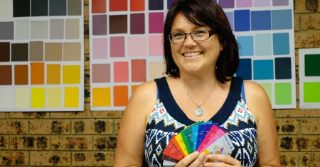
Khadine has done lots of different types of healing and one thing that she has been advising on is the power of colours in business. She made some great points here and I’d love to share this all with you.
3 x Common Colour Branding Mistakes People Make! (Guest Blog by Khadine Aharon):
Colour has always been a passion in my life. I remember choosing my first rainbow dress with my mum when I was just two. I first started learning about colour psychology and colour therapy more than twenty years ago. Now colour is an integral part of my business, with healing, Colour Your life workshops and supporting businesses to discover the best colours to use for their branding.
What businesses don’t realise about colour:
The biggest thing businesses don’t realise about colour in their branding is that the colours tell an unconscious story to their clients.
Colour is often the first communication you have with your client. When someone looks at your website for example, before they read anything their mind unconsciously registers and reacts to the colours they see. The colours can help you to engage with your client or create a barrier to them using your service. If you doubt this, consider why the major fast food chains all use red in the branding? They know that red stimulates your appetite and that it’s associated with being fast (like a red car).
So ideally you want your colours to tell a supportive story about your product or service.
3 x Common mistakes:
When I’m at networking events I’m often asked what I think of the colours on people business cards. My most common response is “do you want me to be honest”? There are common mistakes people make with their colour branding and most businesses can improve the colour story for their service/product.
Mistake number 1: Using your favourite colour
Many people decide what colours to choose for their branding simply because they are their favourite. Additionally many graphic designers will ask you what your favourite colour is and base your logo design on that.
Unfortunately a person’s favourite colour does not reflect the service they provide or the message they want to give to clients. For example, if a person’s business is a restaurant, and they wanted blue for the branding because it’s their favourite colour, the use of blue would not help the to attract clients. Blue does not stimulate your appetite. And logically, how many blue foods are there naturally? One exception to this would be an ice cream shop, however we want ice cream to cool us down, not fill us up.
Mistake number 2: Using grey as a primary branding colour
Grey is a widely used neutral. People often use it because they are scared of being expressive with colour or are conservative in personality. Graphic designers will often use grey combined with one bright colour. It looks good visually because it makes the colour pop. However, from a colour psychology perspective grey is neither black nor white. Neither here or there. Unable to make a decision. Some grey can be great if you need to convey that you are conservative and can remain impartial. Otherwise it’s just plain boring.
Mistake number 3: Using just black and white
Black is often suggested if people want to portray that their product/service is sophisticated. This can be true in some circumstances. Like in a luxury car. However consider that black print on white paper is the cheapest printing you can get and you lose that sense of sophistication. If a business card is black and white there needs to be something special about the paper or type of printing to pull sophistication off. Otherwise it just looks cheap. Additionally, plain black and white together in branding often comes across as cold.
Edward’s Post Blog Commentary:
I love Khadine’s work and some great insight there. I remember when I picked my branding colours, I really liked ‘Blue’. It is the colour of trust & professionalism so I thought why not.
There you go, great thinking from Khadine and to learn more about her check out her site right here.
No responses yet